Hey guys, Maneet here with Techtok. It’s been almost two months since the initial release of Android P and I’ve been using it on my google pixel since then so I am quite familiar with almost if not all the new features. That is why I am going to share with you 5 cool New Android P Features.
1) Design

Let’s start it off with the biggest and most obvious change, the new & restyled interface. Everything is round, notifications icons, quick setting toggles, the icons within the settings, search bar, the transparent dock on pixel launcher & more.
Some people like it, others hate it. I personally don’t mind it that much though it feels like some third–party theme downloaded from Play Store. For Example, it looks very similar to a Substratum Theme called flux white. Along with rounding everything Google continues its efforts to provide basic light and dark theming depending on the device’s current wallpaper.
Things like app drawer, quick settings toggles, ball game interface & google feed panel all are affected by the color of your wallpaper.

Adaptive wallpaper color scheme
It would’ve been great to also see a darker theme for notification cards, settings & google cards for a bit more consistency, hopefully, in the next release they can make it happen, lastly, the time in the status bar is not to the left.
2) Launcher

The next new & obvious change is the pixel launcher. To start with, the app drawer has dropped the gradient background featured in Android Oreo. It is replaced by semi-transparent stuff with a shadow effect which also stays put when you long press on wallpaper. There is also your microphone in the search bar to launch voice assistant and the page/scroll indicator is now tucked within the shaded dock and if have some apps just for the work purpose then you will have two separate sections in the app drawer, one for personal apps & other for work apps. These aren’t huge changes but I do appreciate the tiny details that google has added in.

On Left: The new mic icon & search bar on home dock
On Right: The new Android P launcher allows you to split your apps into personal & Work
3) Volume & Power Menu
The coolest thing in this update is the volume controls. They’ve now been moved to the position of volume rocker at the side of the screen, just like the power menu in Android 8.1. There is also a second square beneath the volume slider and tapping on it will cycle between the different ringer modes i) ringer ii) Vibrate & iii) Mute. If you tap on the arrows a menu will slide out and let you quickly view your connected Bluetooth devices, connect or disconnect them.

I also want to mention that with this update the volume buttons now control the media volume by default and no the ringer volume as in the previous version of android. You can still configure individual volume levels in the sound settings which can be easily opened by long-pressing on the second square beneath the volume slider but in my opinion, the three modes are enough for most users anyway.

Lastly, the power menu has a new button named screenshot which if you haven’t guessed takes screenshots. You can still take a screenshot by holding the power & volume button at the same time just in case you are wondering. Before I move on to the next topic there is a fourth button in the power menu that you can enable in settings under lockdown preferences called lockdown. This is meant to temporarily enhance security during specific circumstances by preventing fingerprint-based access as that can sometimes be compelled without a warrant. The only signing method that will be accepted is a PIN Password or Pattern. Once you unlock it, everything will go back to normal.
4) Settings

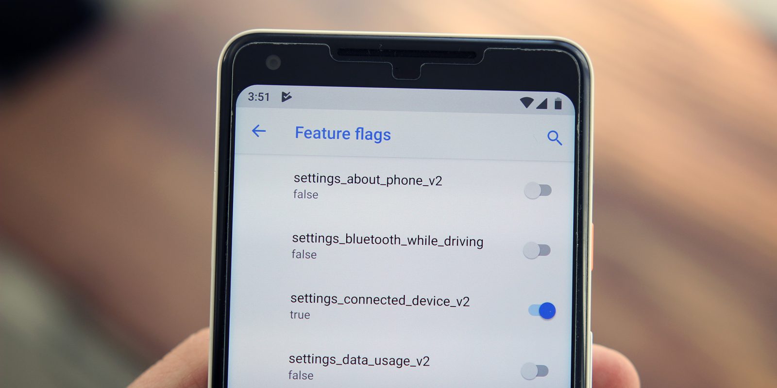
Jumping into the settings you’ll notice that the icons to the side of each category are now colorful. I believe this was done to add more visual differentiation between each block of text. But this is another controversial move, the menus themselves still look the same but there are a couple of new features & modifications that were slipped in. Starting with developer options there is a new setting called feature flags which holds a list of experimental features sort of like Chrome’s hidden flag menu but less descriptive.

Most of them were already enabled by default but there are a few that weren’t. The one labeled “settings_about_phone_v2 ” gives you a different looking interface when you hop into the about phone menu & the one labeled “settings_bluetooth_while_driving” automatically enable Bluetooth while you’re driving, it is not clear what every single one does but if you want to know what most of them do then I’ll drop a link to an article explaining them.
Under the Wi-Fi Settings, you can now meter a Wi-Fi connection much easier instead of having to find it within the data saver settings.

Do not disturb mode has again been modified and this time it’s simpler. When you toggle it in quick settings now, it only performs the old default action for duration selection & pressing the volume down key no longer enables it. Within the settings, you still have similar configurations but rule-based differences are no longer possible.
In the Battery section, it has no longer the “Per-App Battery Usage” data but you can access them within the developer options under the “See Android 8.0 battery Settings” which is a bit weird, and battery saver can now be scheduled to automatically turn on from anywhere between 5% and 70% battery instead of 5% to 15%. In the notification settings, you can now easily track which of your apps have recently sent notifications. Three new themes have appeared within the display section & there is no longer a system UI Tuner, you cannot change the strength of touch vibration & turn off the vibration in general when you receive a phone call or notifications in the accessibility settings.
The Easter Egg is completely colorful, trippy & changes colors every time you open it.

5) Smaller Features
Lastly, within this huge update, there’s plenty of smaller features & modifications that you may find useful so I am going to explain in brief all the ones I found.
Starting with the screenshots you can now mark them up but that only works on Pixel 2 & Pixel 2XL & there are even some sweet transition animations when you switch apps or switch an activity.

When you don’t have auto-rotate enabled and you turn the device to landscape or portrait, a small navigation button would show up in navigation offering to change the rotation.
Text selection also shows a more precise zoom lens. The Unlock pattern now fades out as you swipe.
The night light tab now tells you when it’ll turn on if you have a schedule for it. You have charging sounds & the alarm tile now shows you upcoming alarms, adaptive brightness animates the quick settings slider as it changes & lastly the USB Menu is now a full-fledged menu instead of a pop-up when you connect your device to your desktop.
These are all the Top 5 Changes in Android P. This is the First Release so keep in mind that all these features can change or be removed in a feature update.


